Getting asked to refresh an existing band is an exciting opportunity for us. We enjoy the challenge of following the road not taken. Bush Nook tasked us with updating their simple aesthetic, asking us to create a reliable brand that could provide its customer base with a comfortable stay and valuable information about the local area.
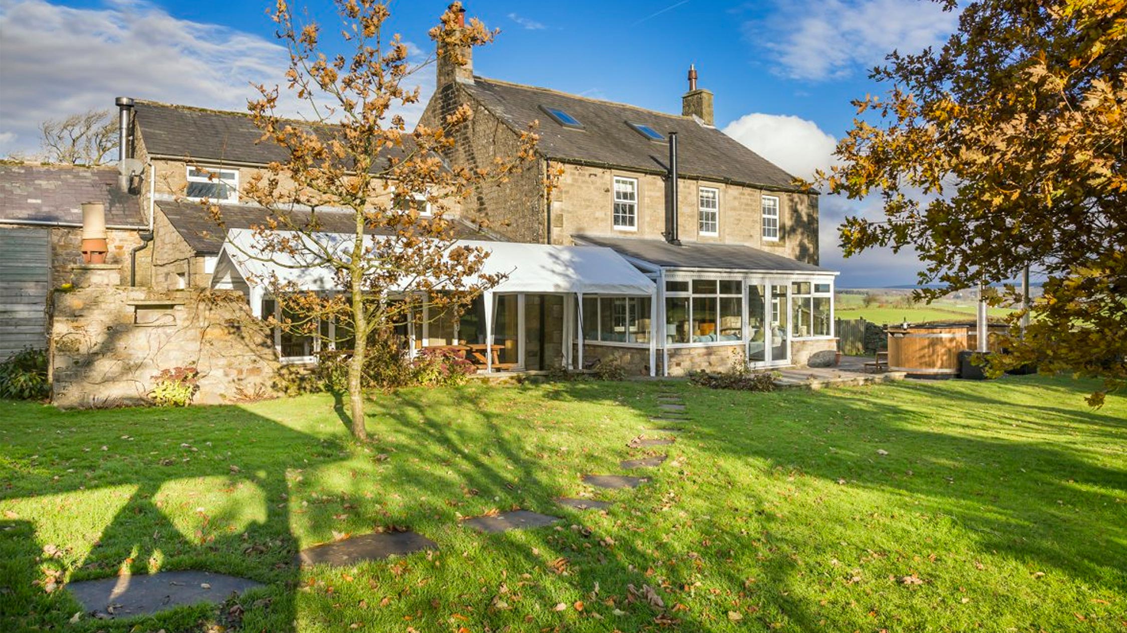
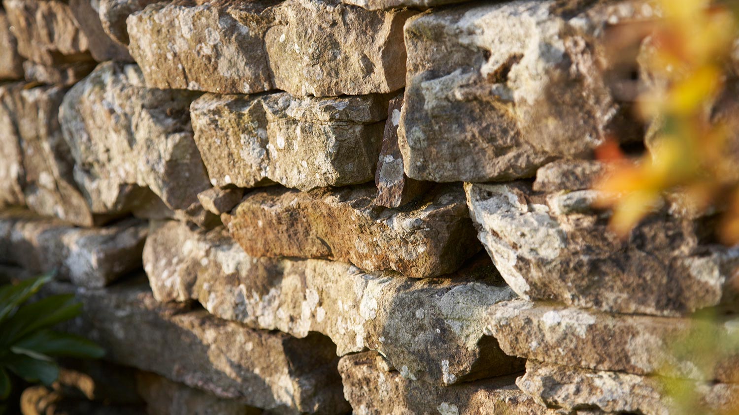
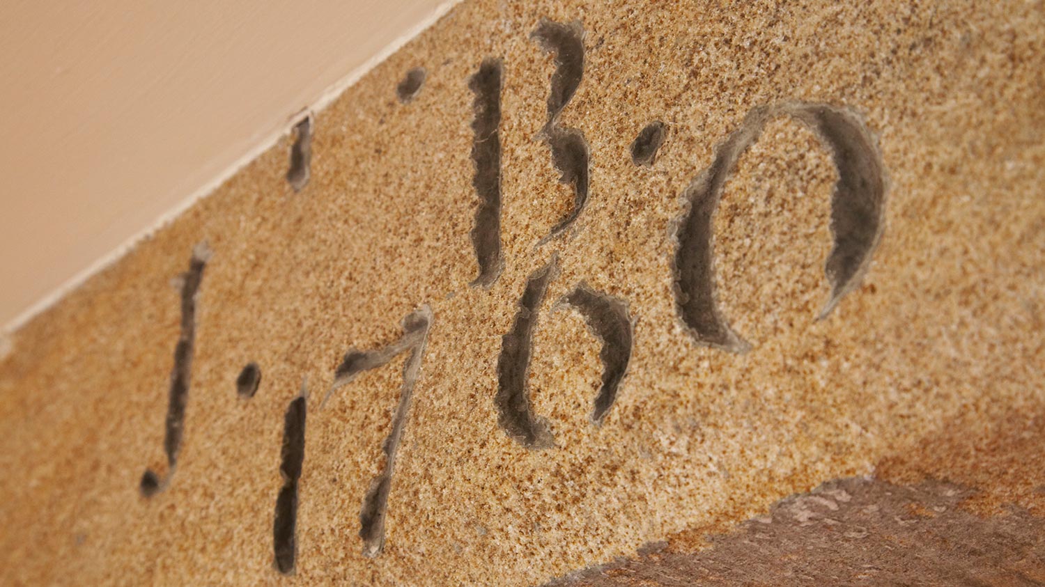
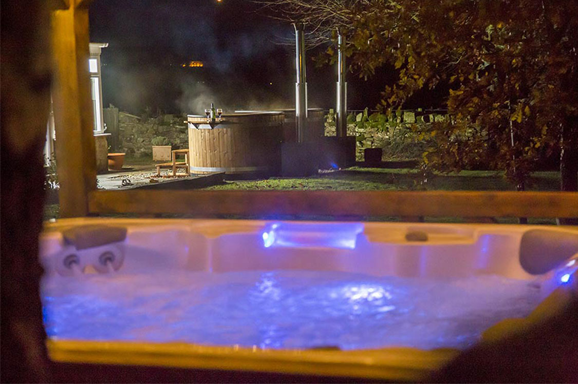
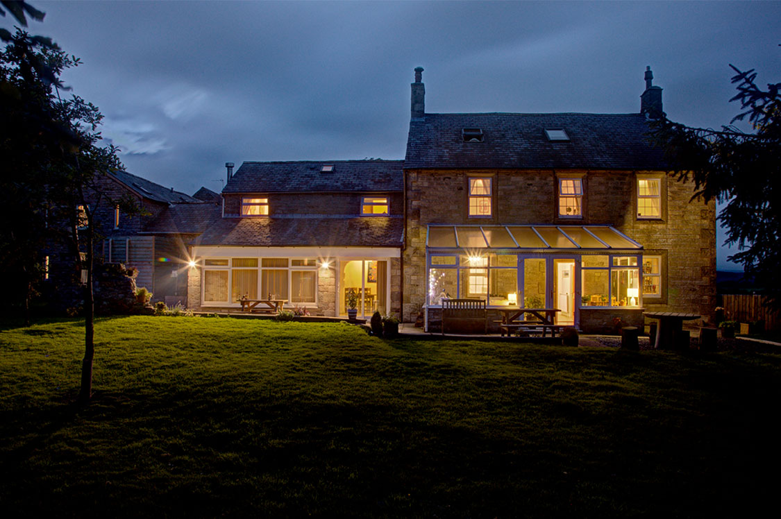
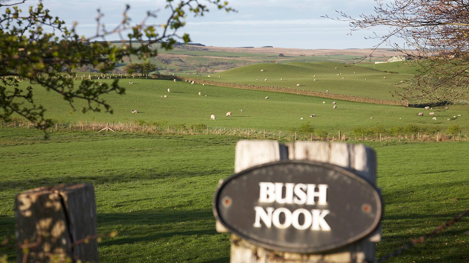
Steeped in history, the Bush Nook farmhouse was built is 1760, just a stone’s throw from Hadrian’s wall. The original farmstead, Gilsland, expanded twice, once in 1811 and again in 1849, ‘borrowing’ from the wall’s fortification.
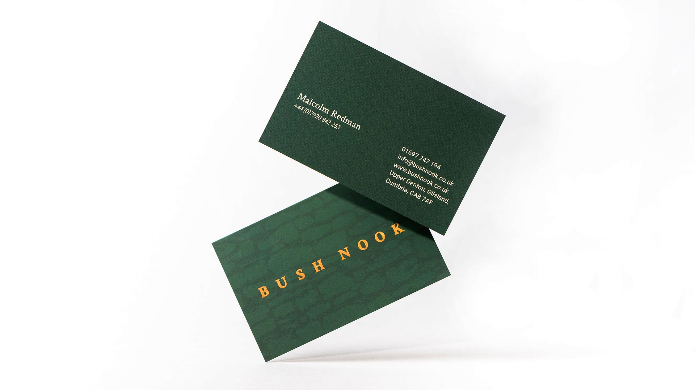
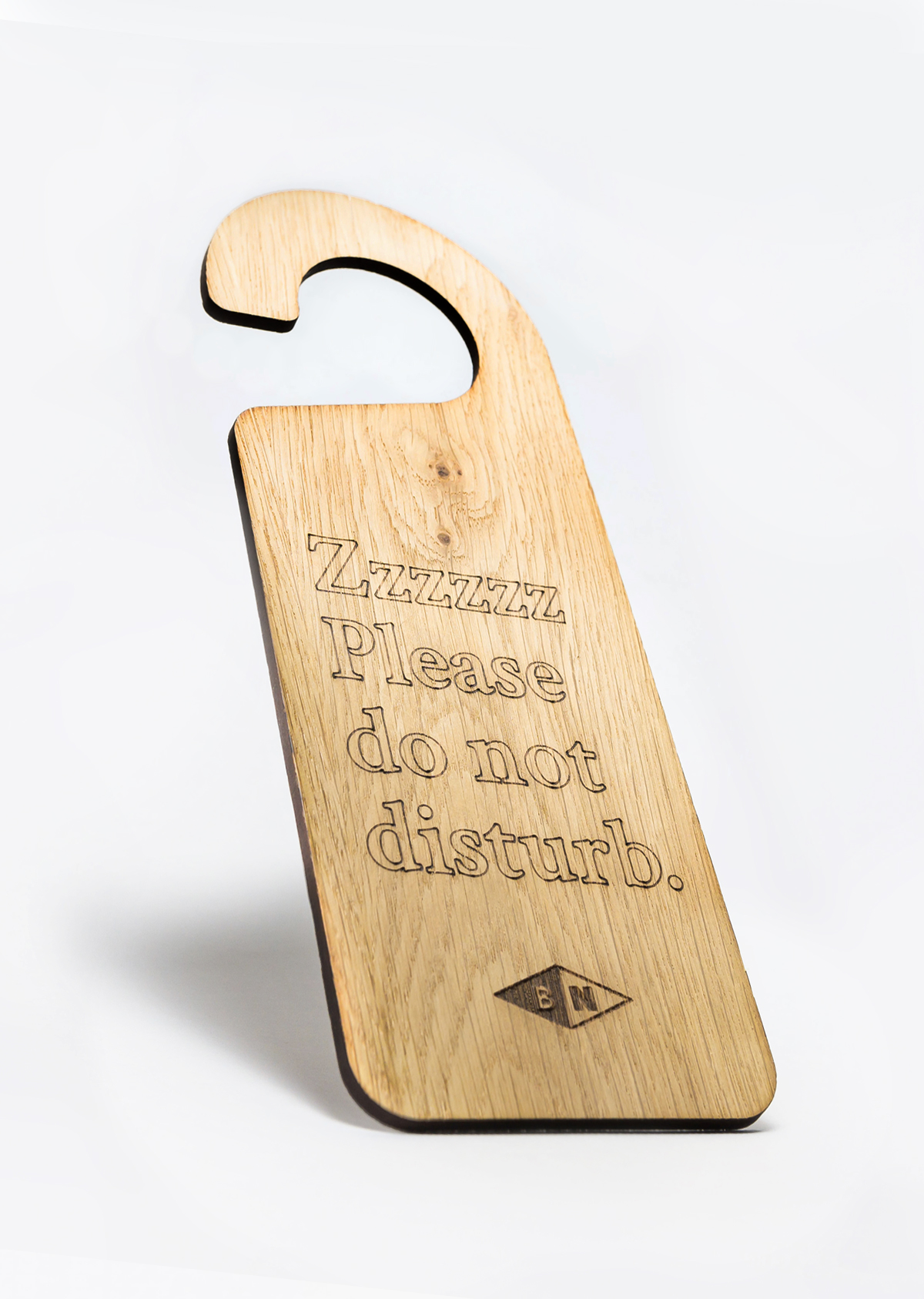
Here our challenge was to bring Bush Nook’s existing visual language into the 21st century. We took our colour palette from the local area, handpicked textures from the natural materials, borrowed the typography for the project from the original iron farmhouse sign, and our logo for the client took inspiration from local Roman coins.
Custom key-rings, branded envelopes, and the idea for handwritten welcome notes for customers came from discussions with the client about how we could place a high quality, tailor-made experience at the forefront of the business. Although these extras were not specified in the original brief, it’s following surprises like these down rabbit holes we find an exciting part of the job, and shows what happens when client and studio communicate clearly with the aim to discover fresh and exciting ideas.
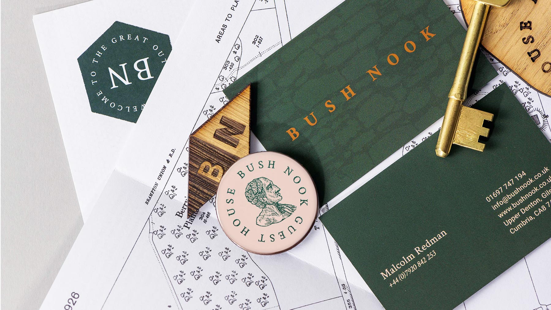
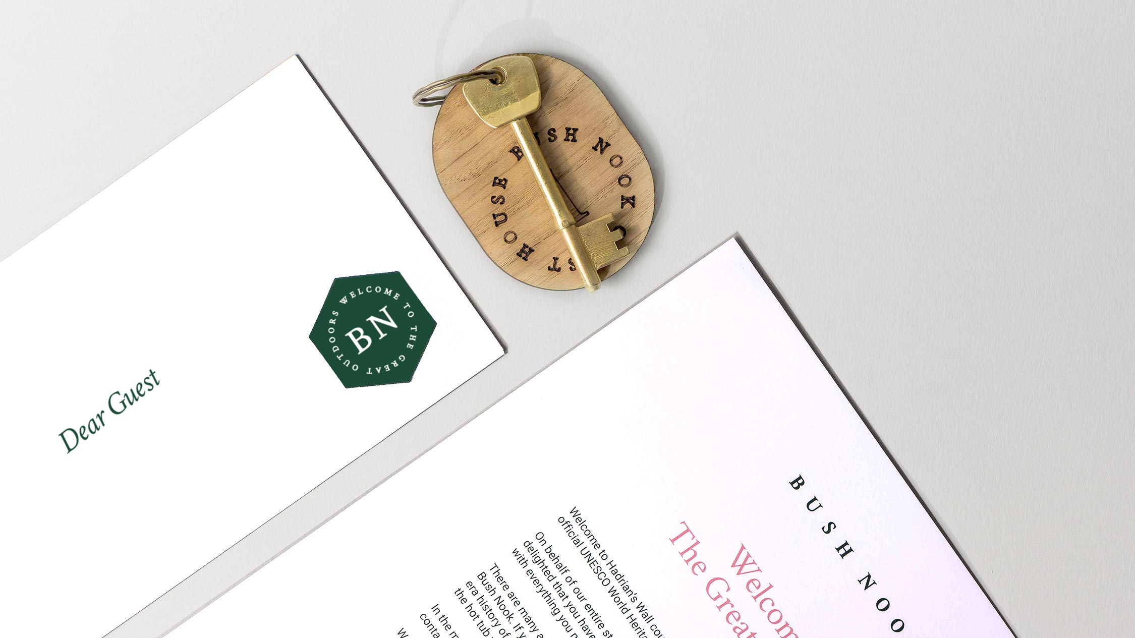
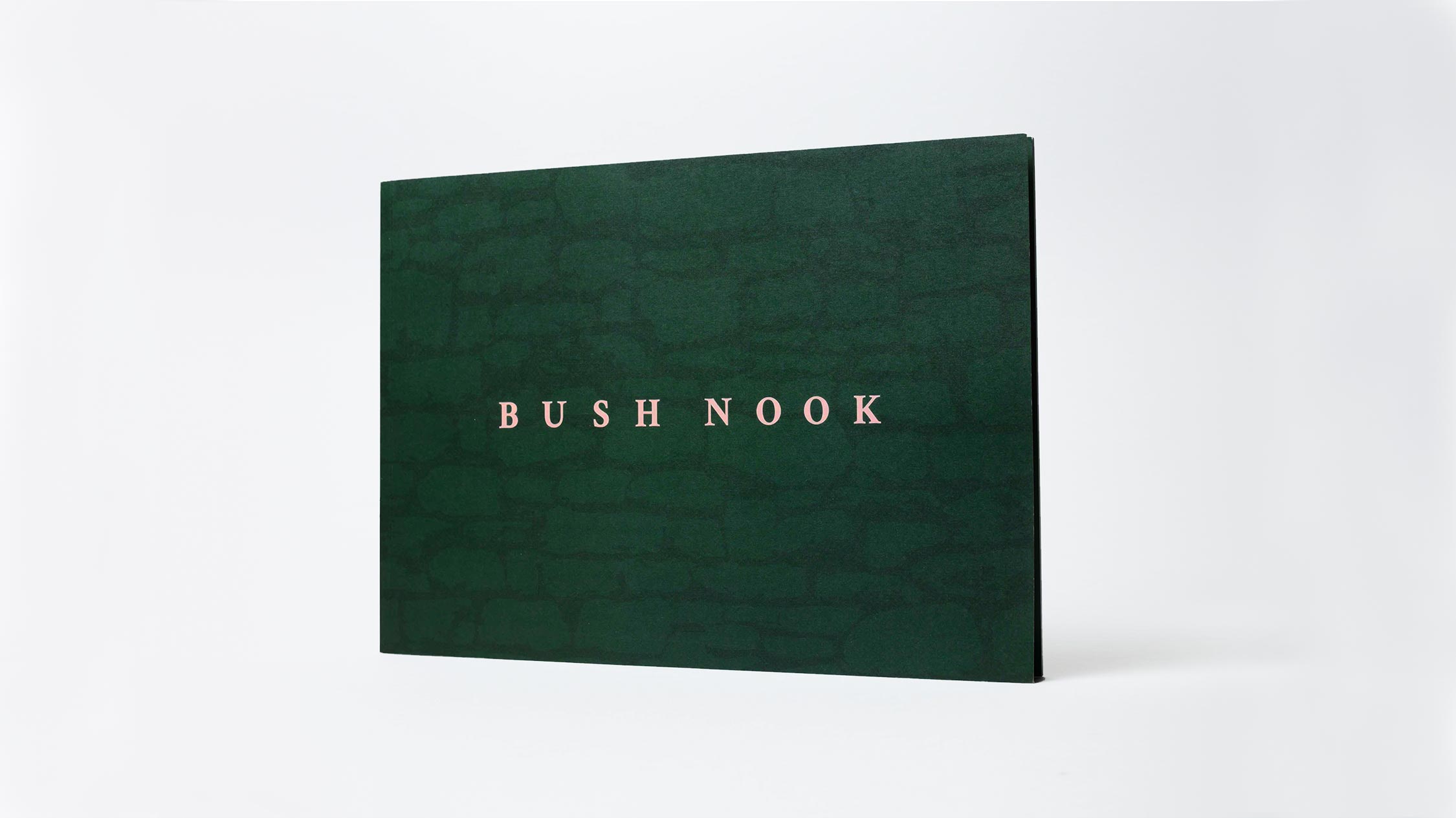
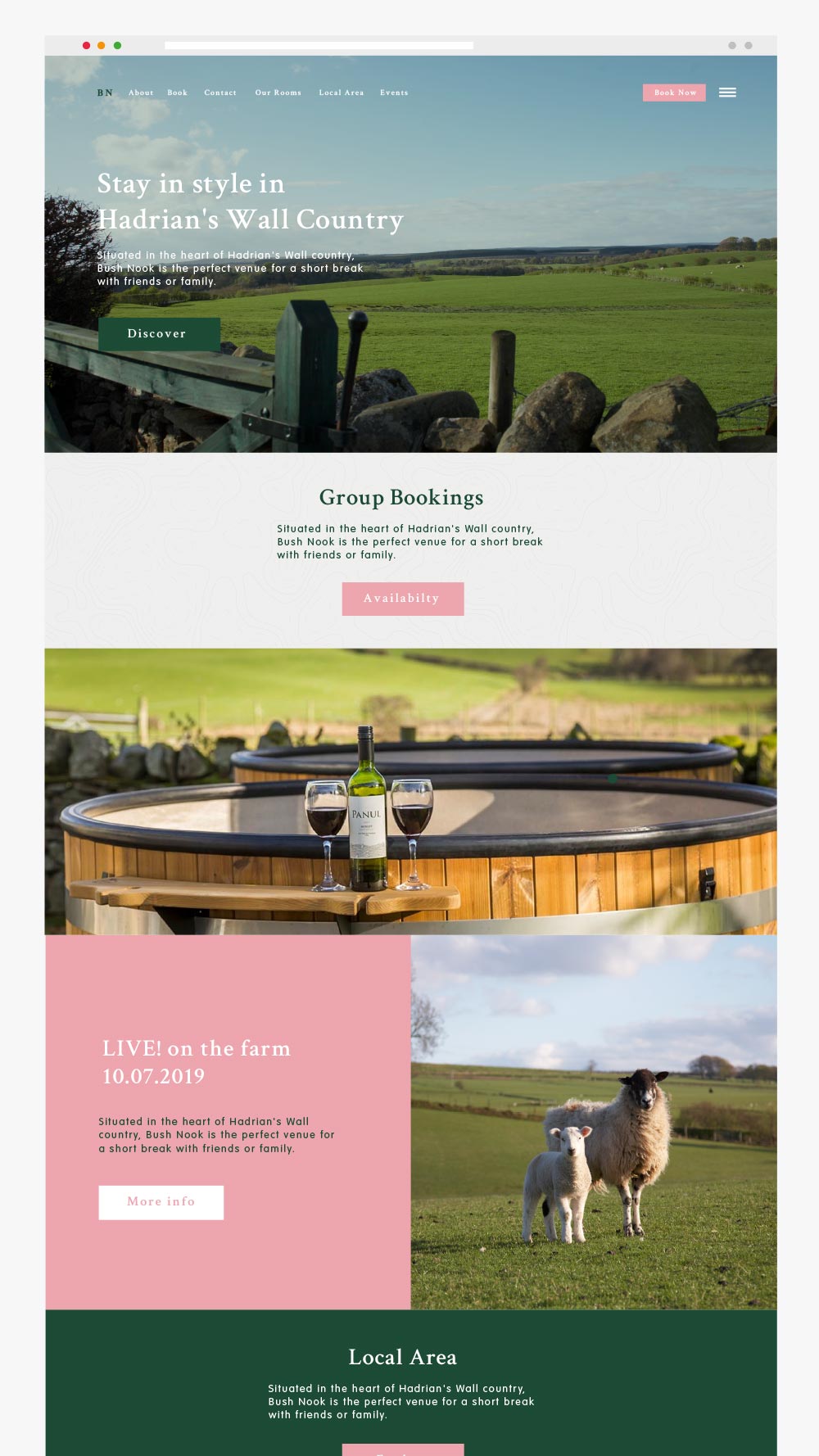
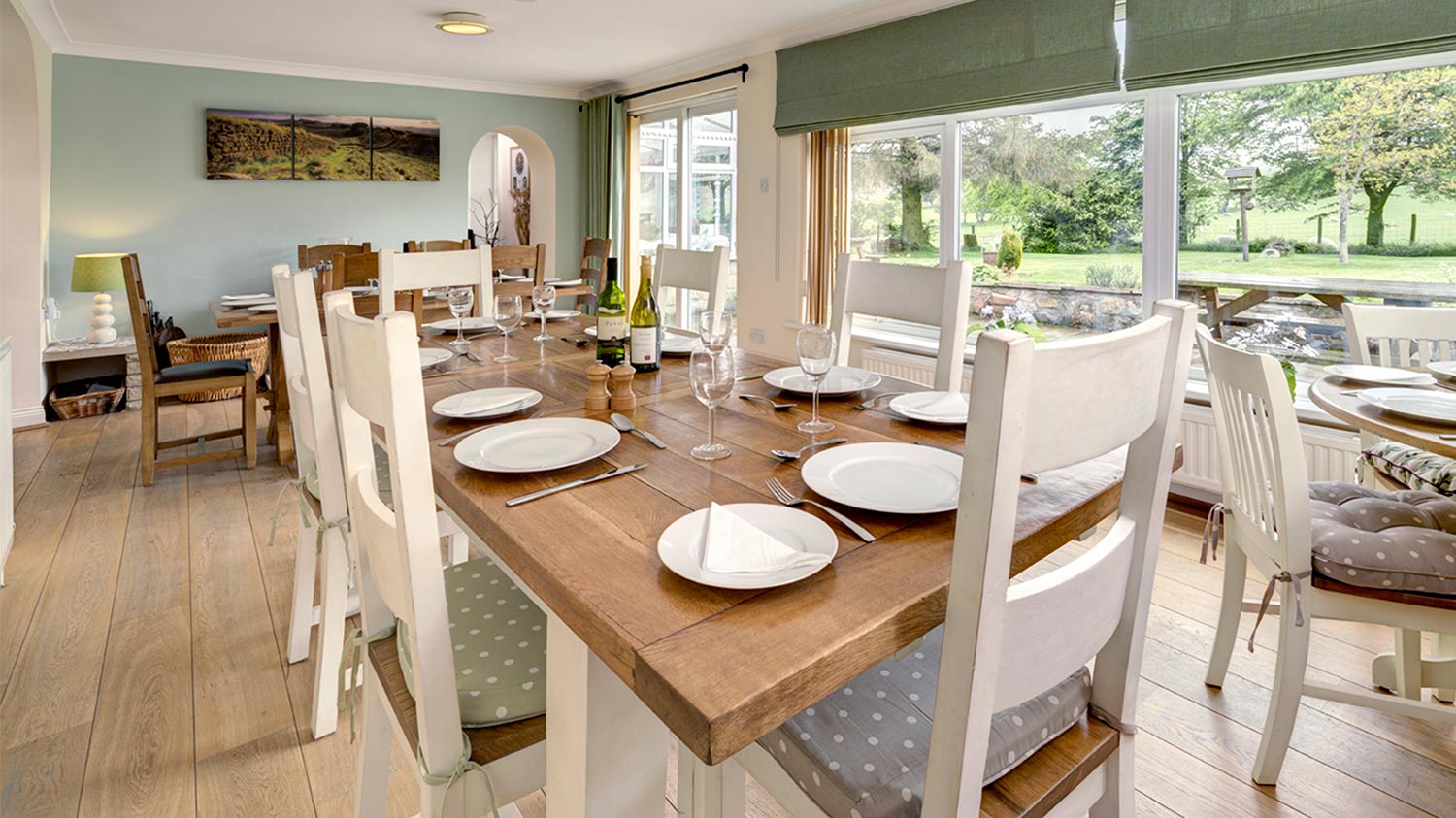
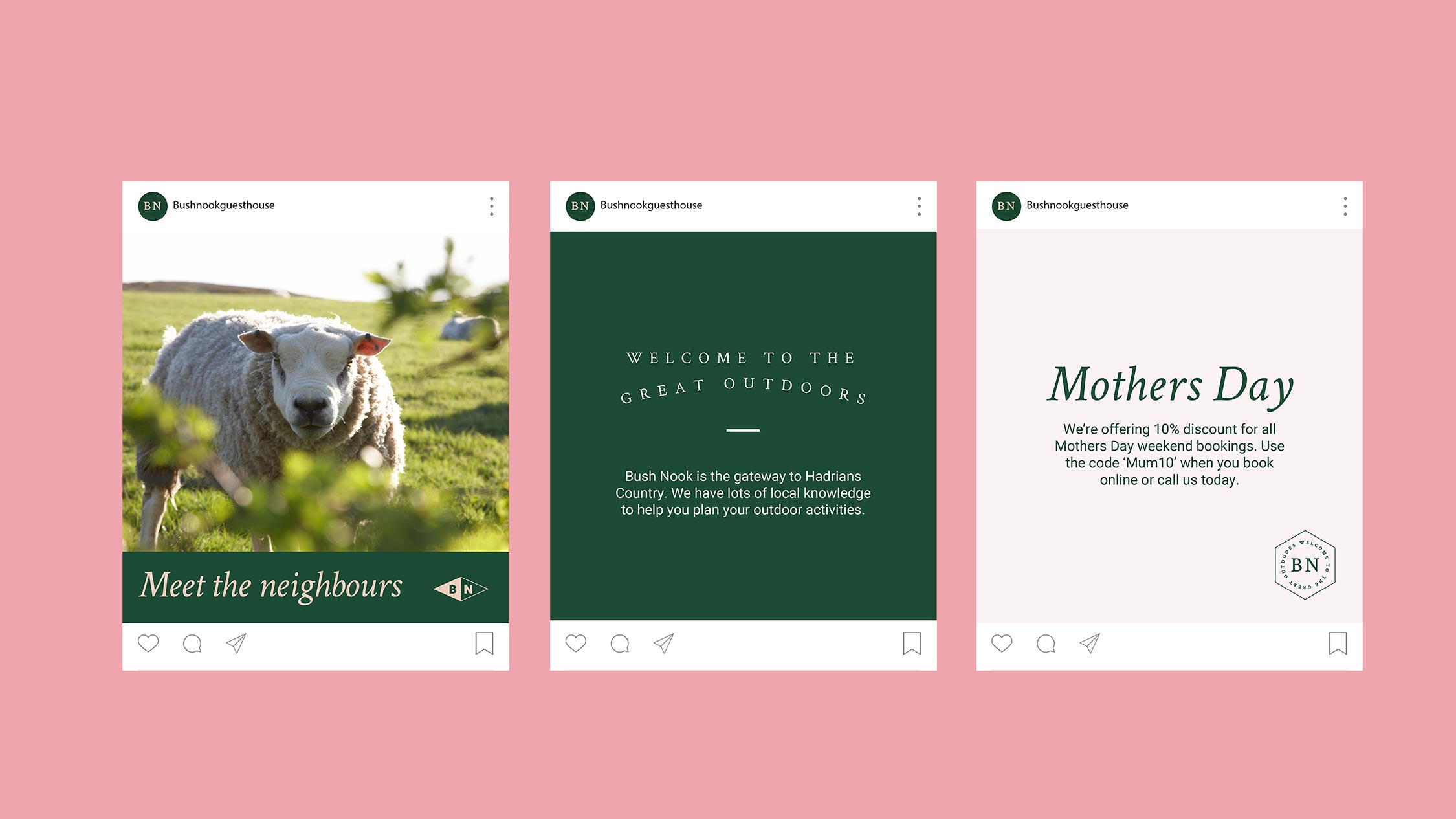
Bush Nook approached us to create a visual identity for their guesthouse. We delivered a fresh brand guidelines, social media content, merchandise, stationery, and digital design.