Services
Branding
Logo Design
Packaging Design
Website Design
Collaborators
Photos by Amy Heycock
Website
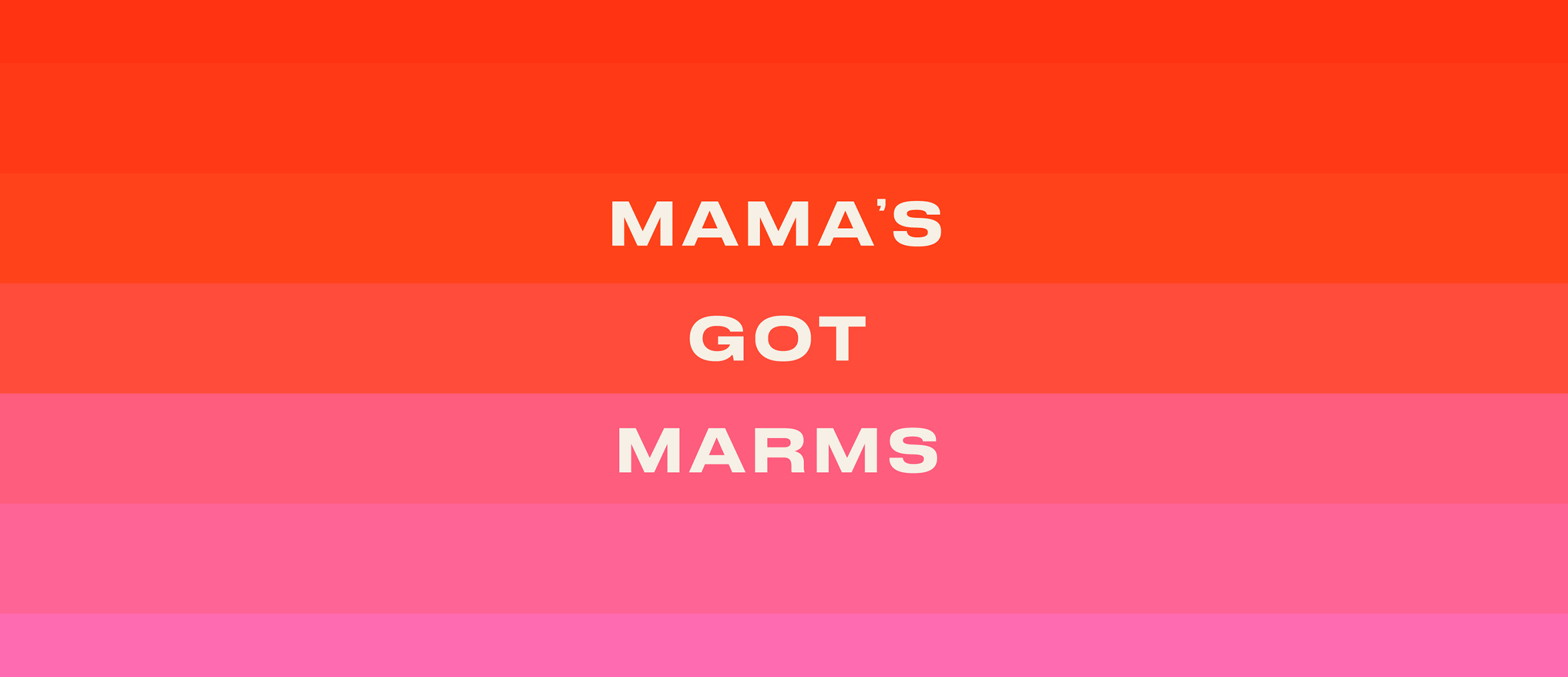
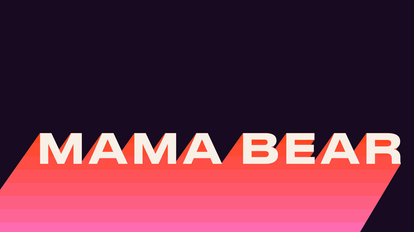
In the initial design meeting we vowed to steer clear of old cliches, swapping village fete competition stalls for trendy apartment cupboards. Mama’s got marms, and it was time to let people know.
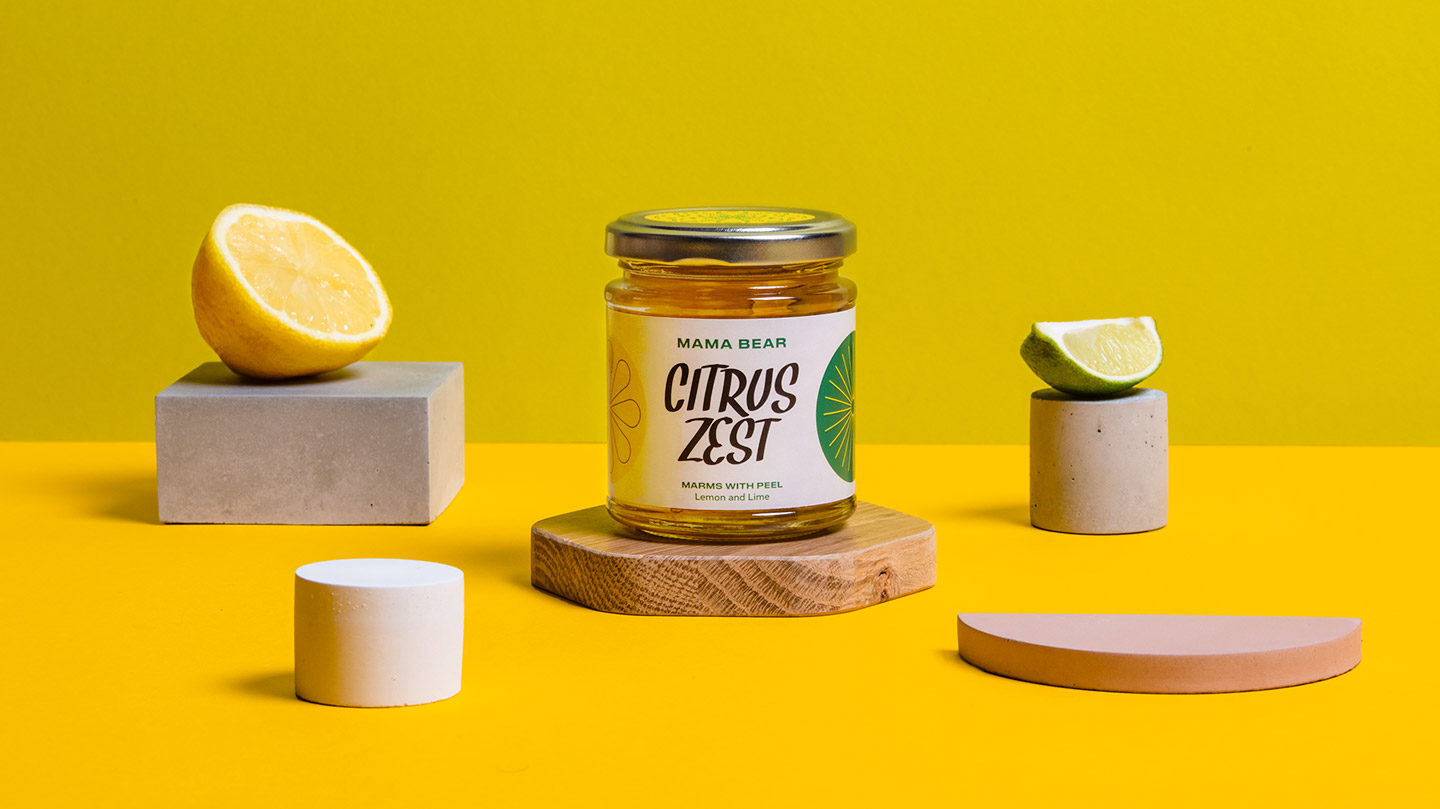
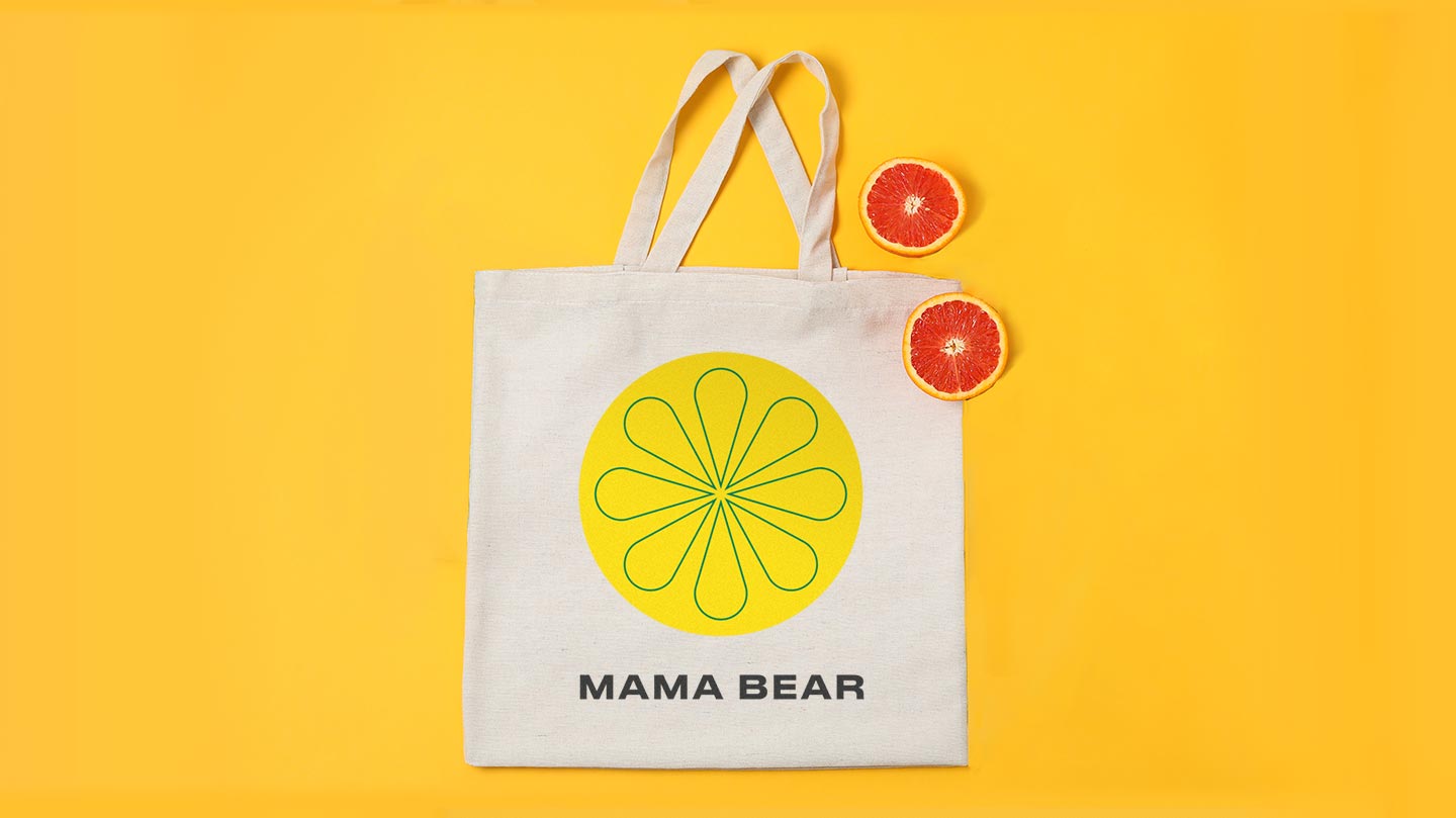
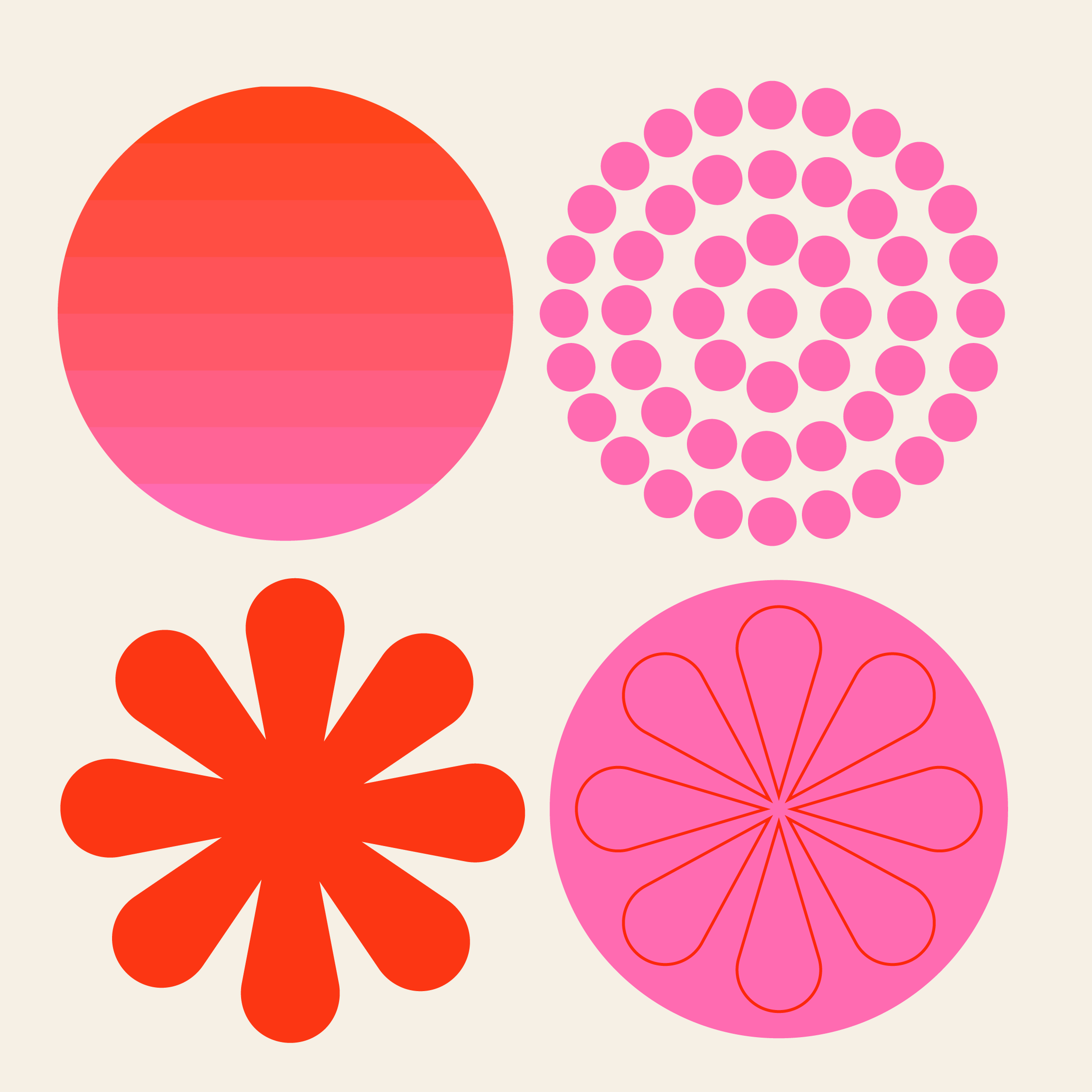
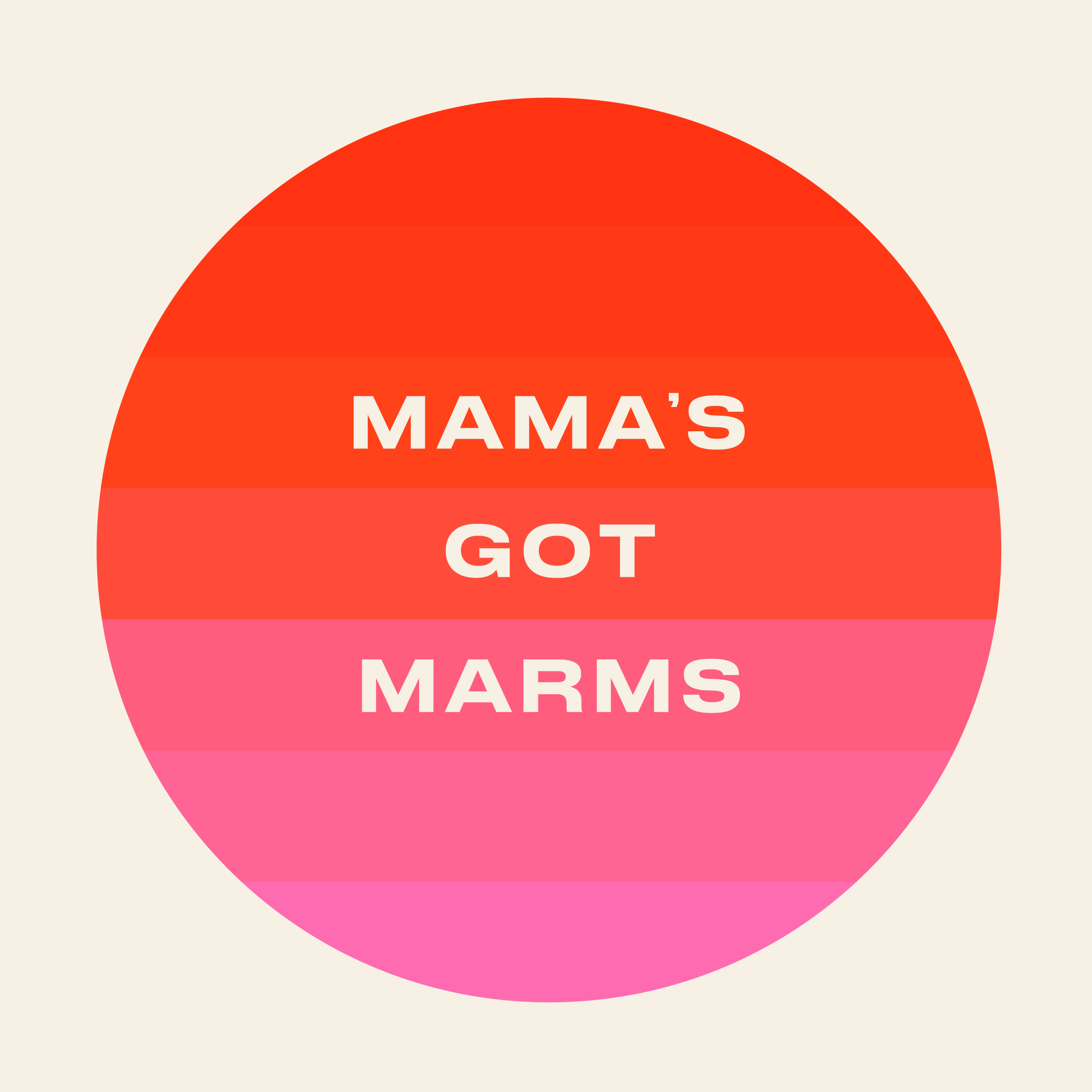
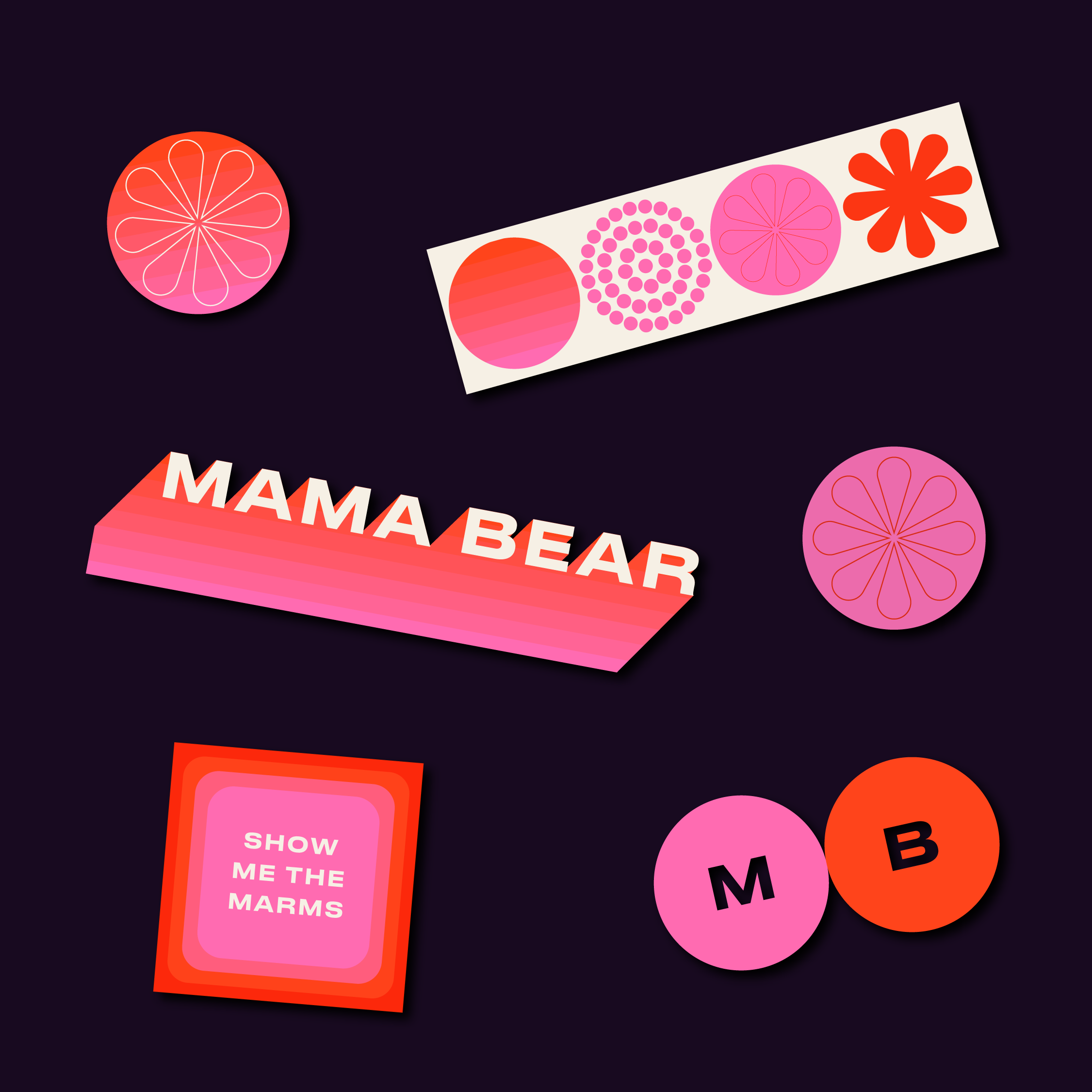
Our approach was to pair a punchy, contemporary colour palette with the shapes and patterns of mid-century design. This tongue and cheek nod to British culinary nostalgia was right on brand for Mama Bear, respecting the history behind their product but looking to the future. Bright colours and retro-gradient styles create a language that is more Cream 1990 Dance Classics than 60s faded tupperware.
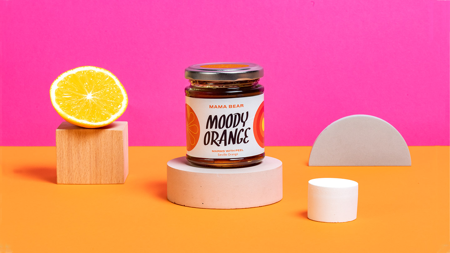
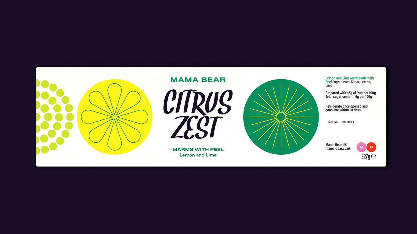
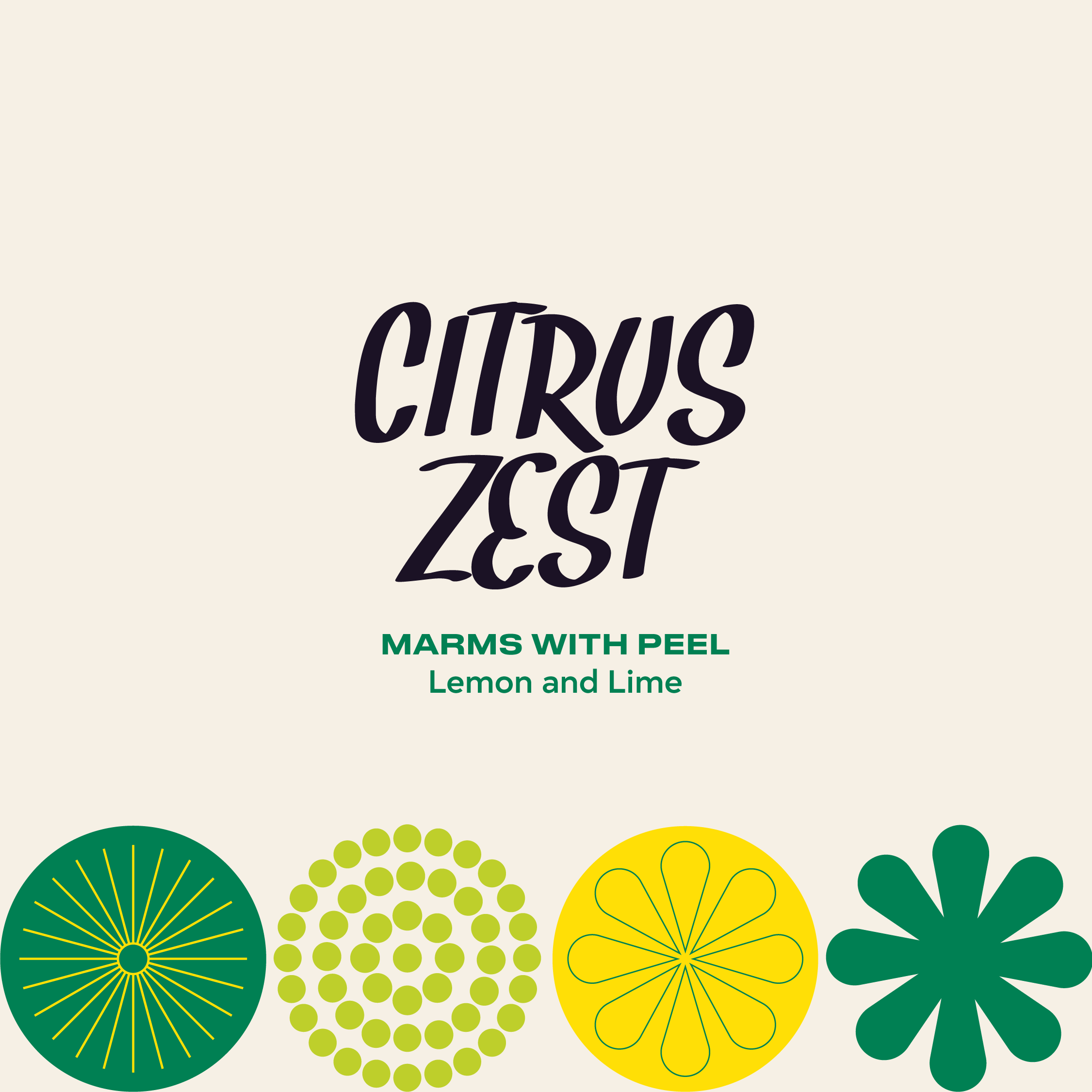
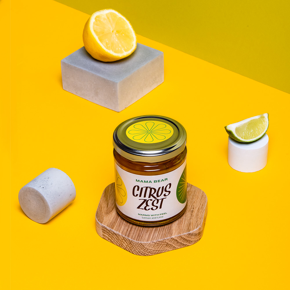
When competing for attention on shelves, we went bold. We kept the packaging simple, minimal and punchy. The hand-written sharpie-style typography alludes to the small-batch origins of Mama Bear.
Our label design is versatile and will allow Mama Bear to expand the range as the business grows, with room in the language to incorporate limited editions or collabs as and when.
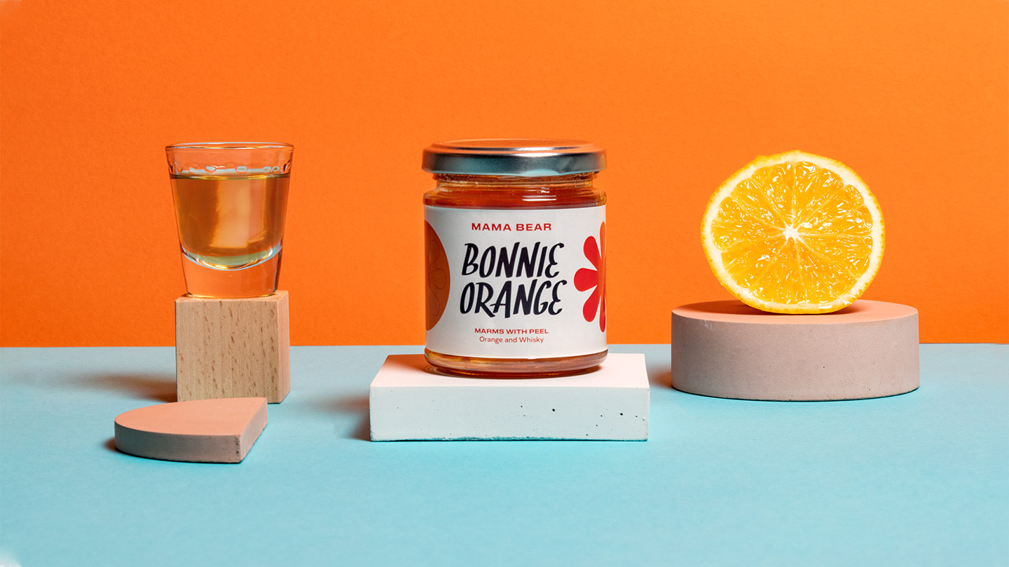
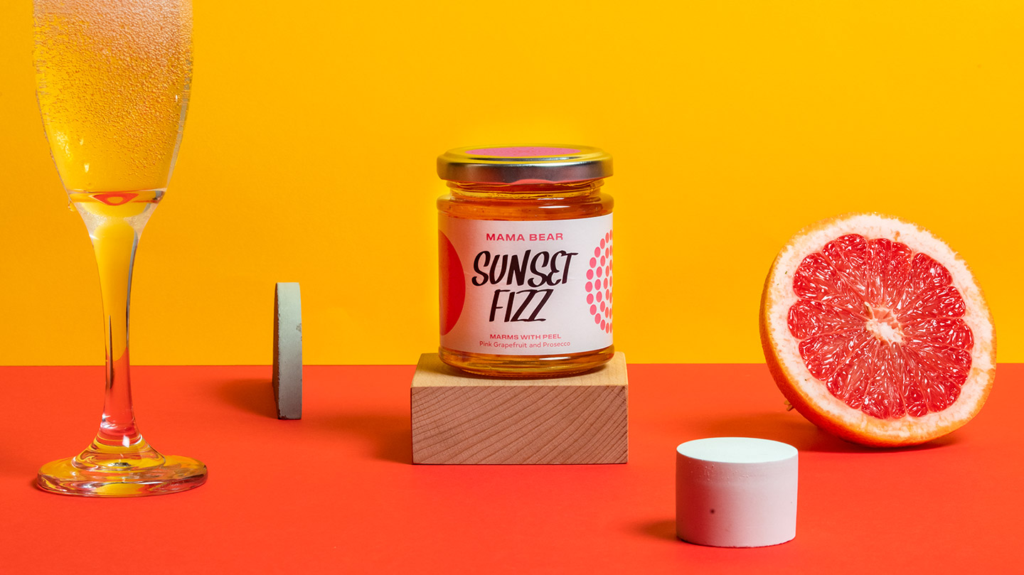
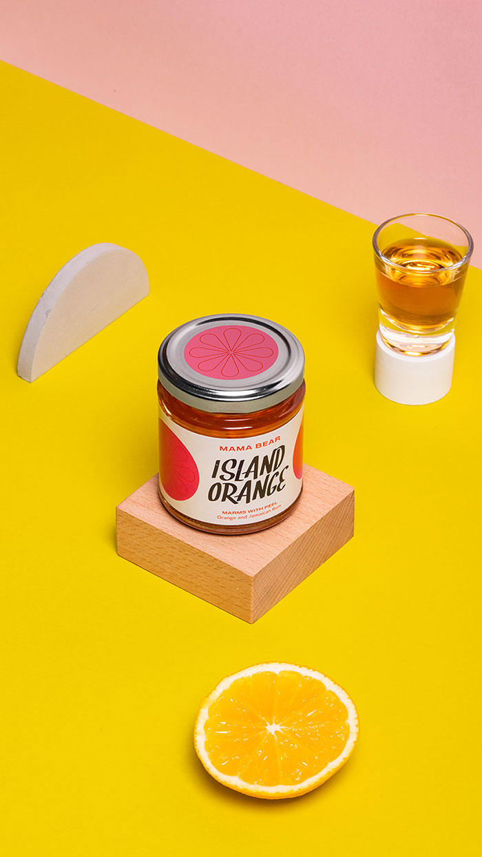
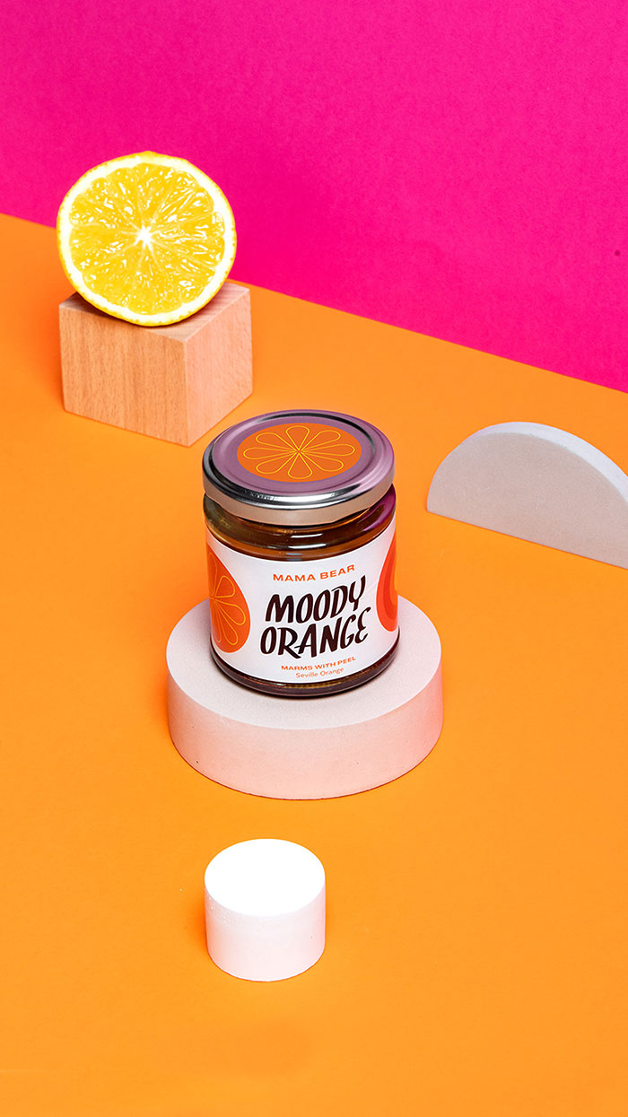
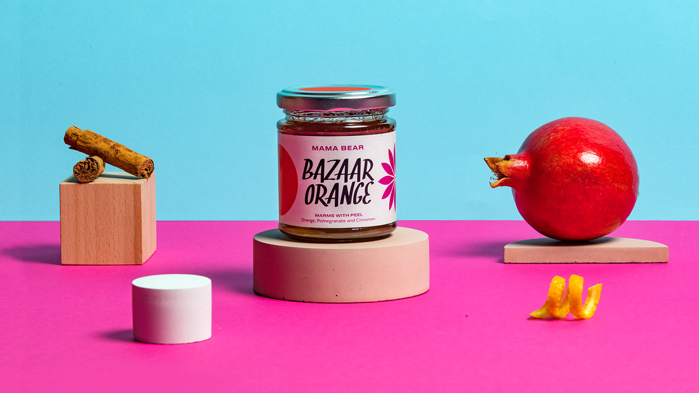
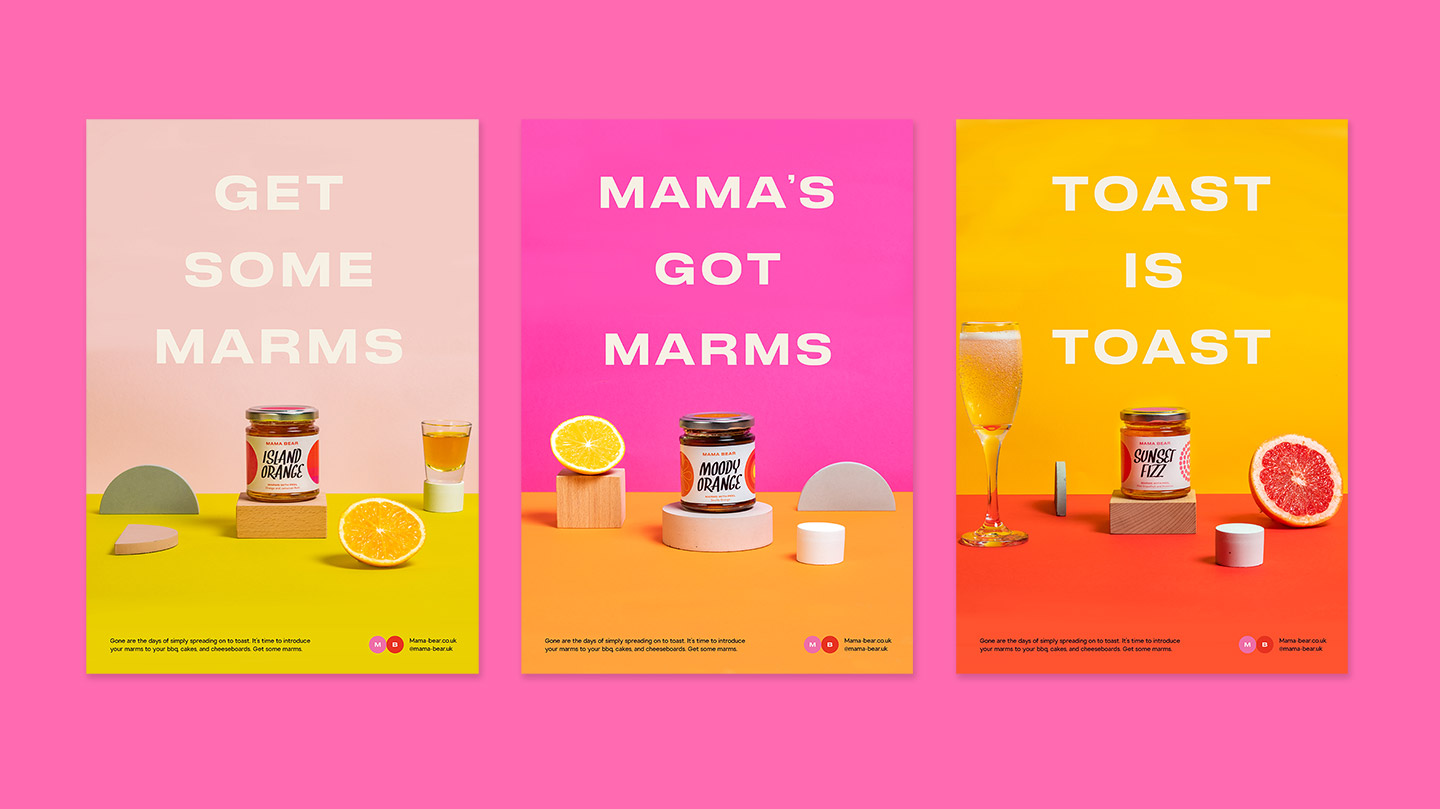
Mama Bear had a range of marmalades, each with their own individual taste profiles. The product names put a fresh spin on these traditional flavours. Each marmalade had its own colour palette and corresponding illustrations that characterised the flavours locked away. Side by side, the customer can instantly gather all the information about the product range without batting an eyelid.
This packaging was captured wonderfully by Amy Heycock photography.
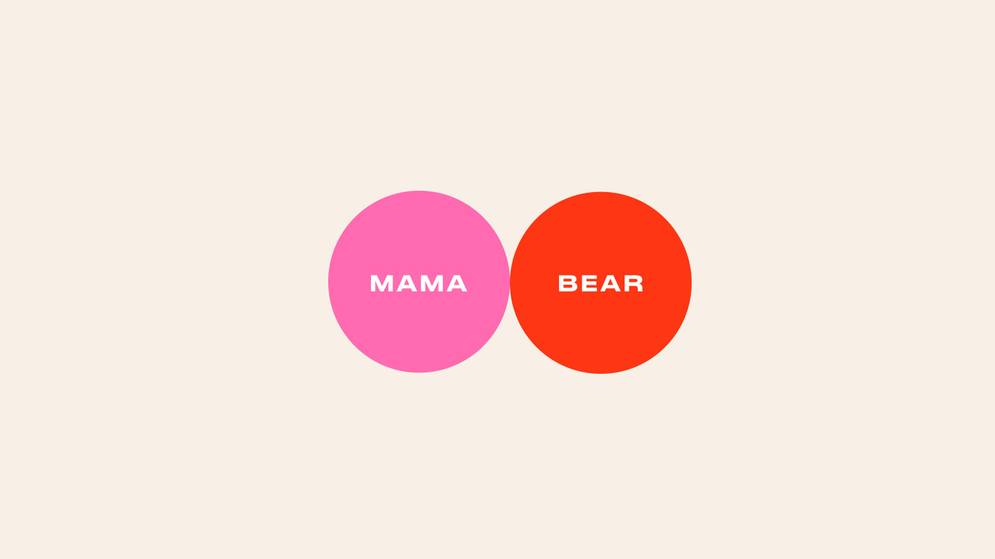
Introducing Mama Bear, professional marms dealer.
Adopting this youthful contraction for the project allowed the client to instantly erase any preconceptions marmalade may conjure in the mind’s eye. Mama Bear is a unique brand that it knows its audience, so our socials had to step up to the plate.
Well written copy and playful product photography cement the brand’s identity. Using a combo of bold graphics, abstract shapes and a large catalog of high res images, we were able to give the client the tools for them easily create content on the fly.
Mama Bear wanted to showcase products, direct sales and encourage collaboration and the sharing of recipes. Simple. Using brand language we created an engaging experience for the user.
Website Build by frazersparham.co.uk
Nothing excites Turtle & Hare more than a challenge to push the boundaries using the limits of graphic design. We delivered an engaging brand identity to Mama Bear that was bright, zesty and on the nose, but factored in the wiggle room to create personalised content to match the ever changing socials-game. Get some marms!