Cliches of the “eco-friendly” echo throughout many refill stores. Zero Muda made it a priority to avoid this DIY approach and aimed to incorporate the premium and the slick into the brand, an approach popular over in Europe and Australia.
Our brief was to create a visual identity that would communicate the brand’s core messaging in a clear and desirous style. It was important for the client that it reflected the quality of the products on sale and echo the experience of zero ‘muda’: wastefulness. A fresh approach, minimal in all the right places without compromise, would create a contemporary brand that the local community could rely upon and grow around – the core of the client’s message.
A first look video showcased the attention to detail throughout the store. Zero Muda’s exterior had to match their carefully choreographed, intuitive interior but be bold enough to encourage new customers.
The premium natural materials used throughout the shop, such as the large glass panes, copper and litany of timber creates a welcoming atmosphere. Large glass panes frozen in minimal green frames is attention grabbing, while the simple typography and instruction of Zero Muda crowns the shop front.
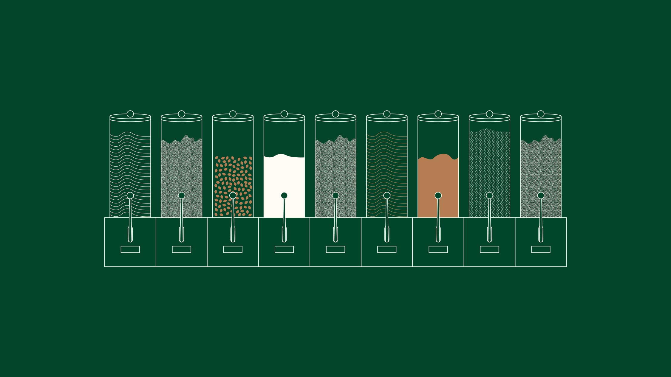
Once through the door, and in order for people to make the jump to re-fill shopping regularly, we had to make the process as breezy as possible. Instructional videos paired with interactive social media posts are informative and instructive.
To see the full project with Zero Muda click the image below.