Services
Identity Design
Packaging Design
Print Design
Digital Marketing
Photography
Collaborators
Video by Damon Stead
Photos by Rikki Chan
Website by Glenn Taylor
Website
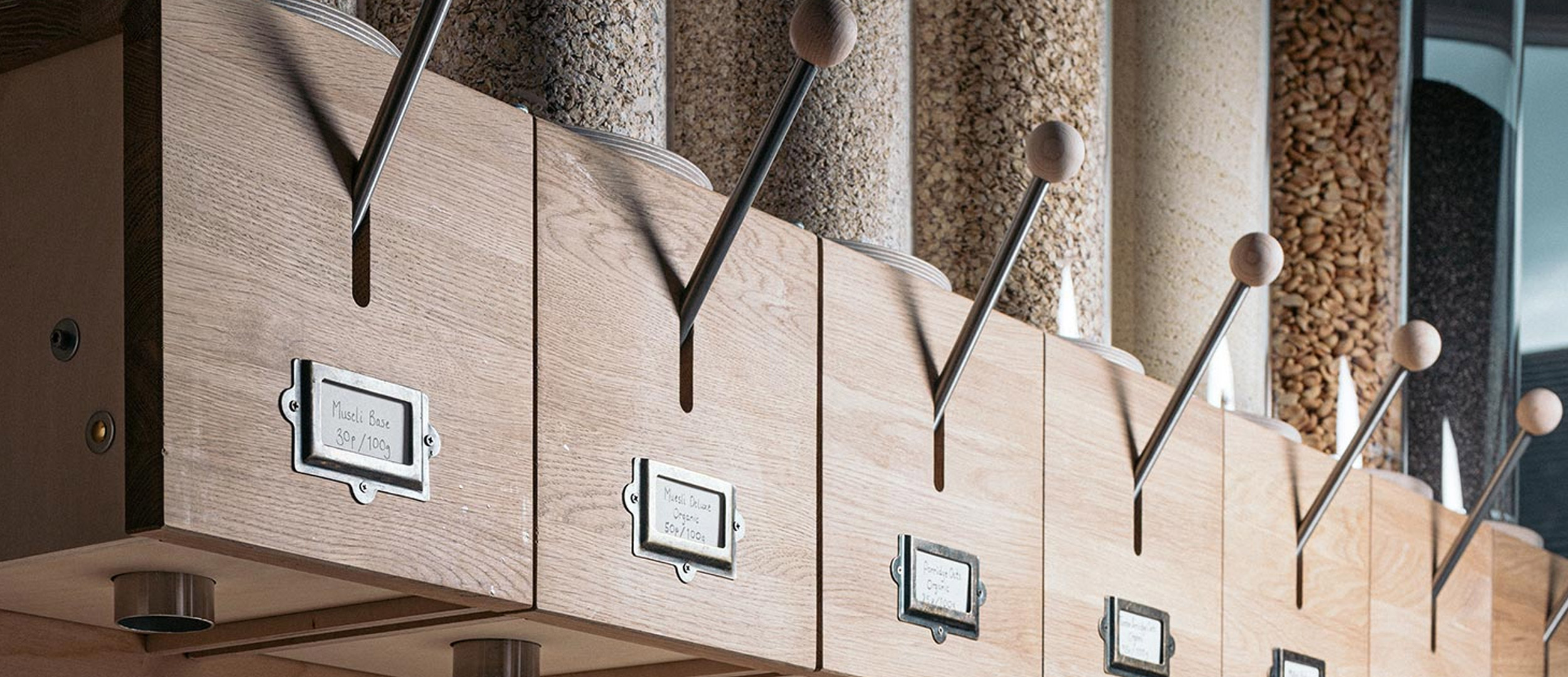
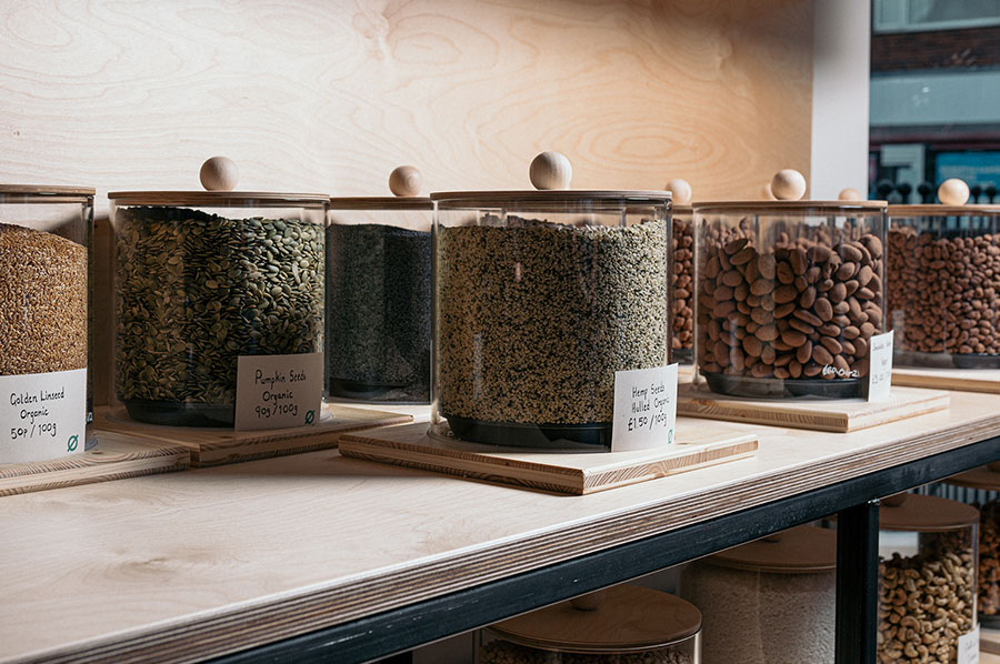
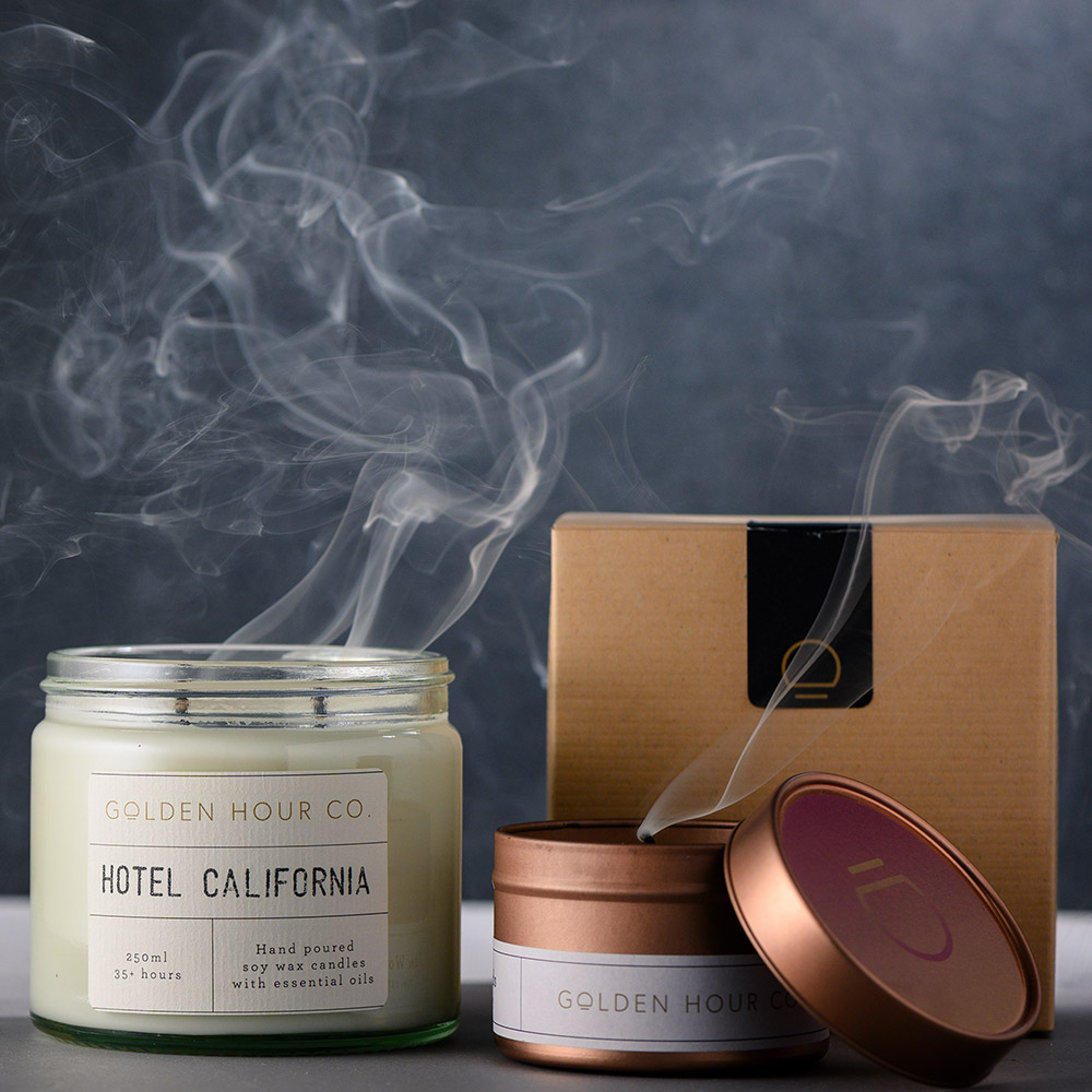
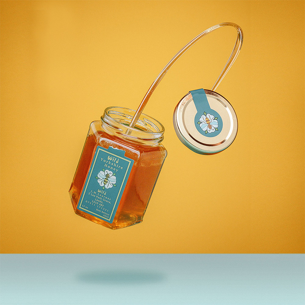
The premium natural materials used throughout the shop, such as the large glass panes, copper and litany of timber, influenced the project’s palette. Alongside the minimal typography style and informative illustrations, the overall product was welcoming and warm.


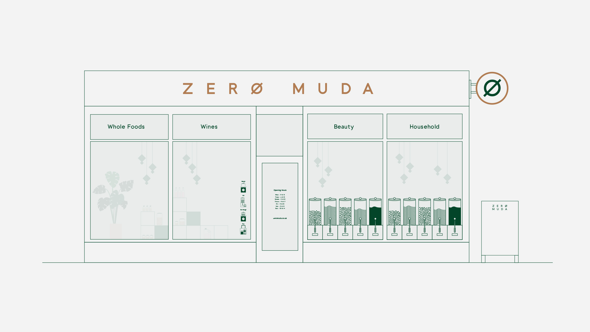
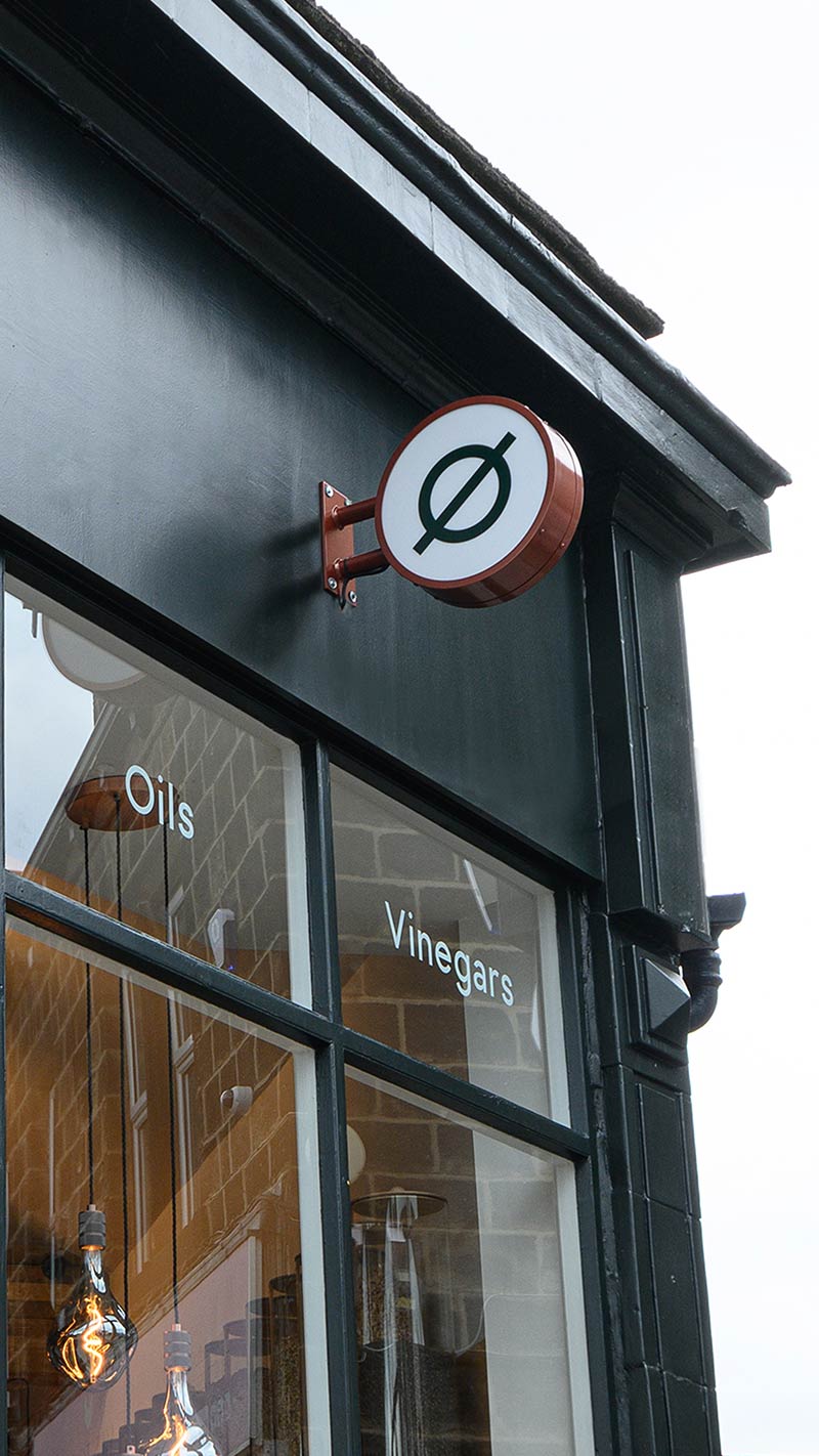
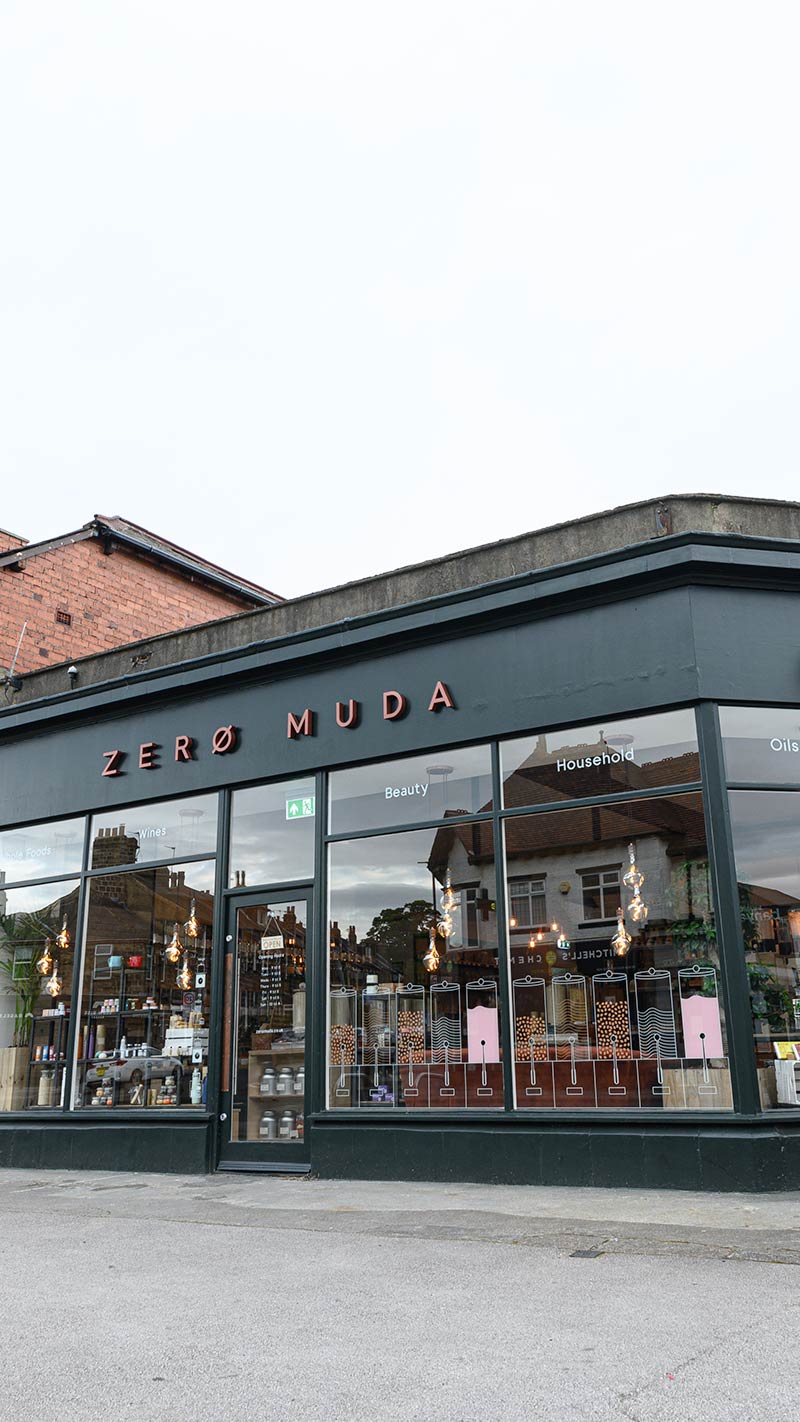
Zero Muda’s exterior had to match their carefully choreographed, intuitive interior but be bold enough to encourage new customers. Large glass panes frozen in minimal green frames is attention grabbing, while the simple typography and instruction of Zero Muda crowns the shop front.
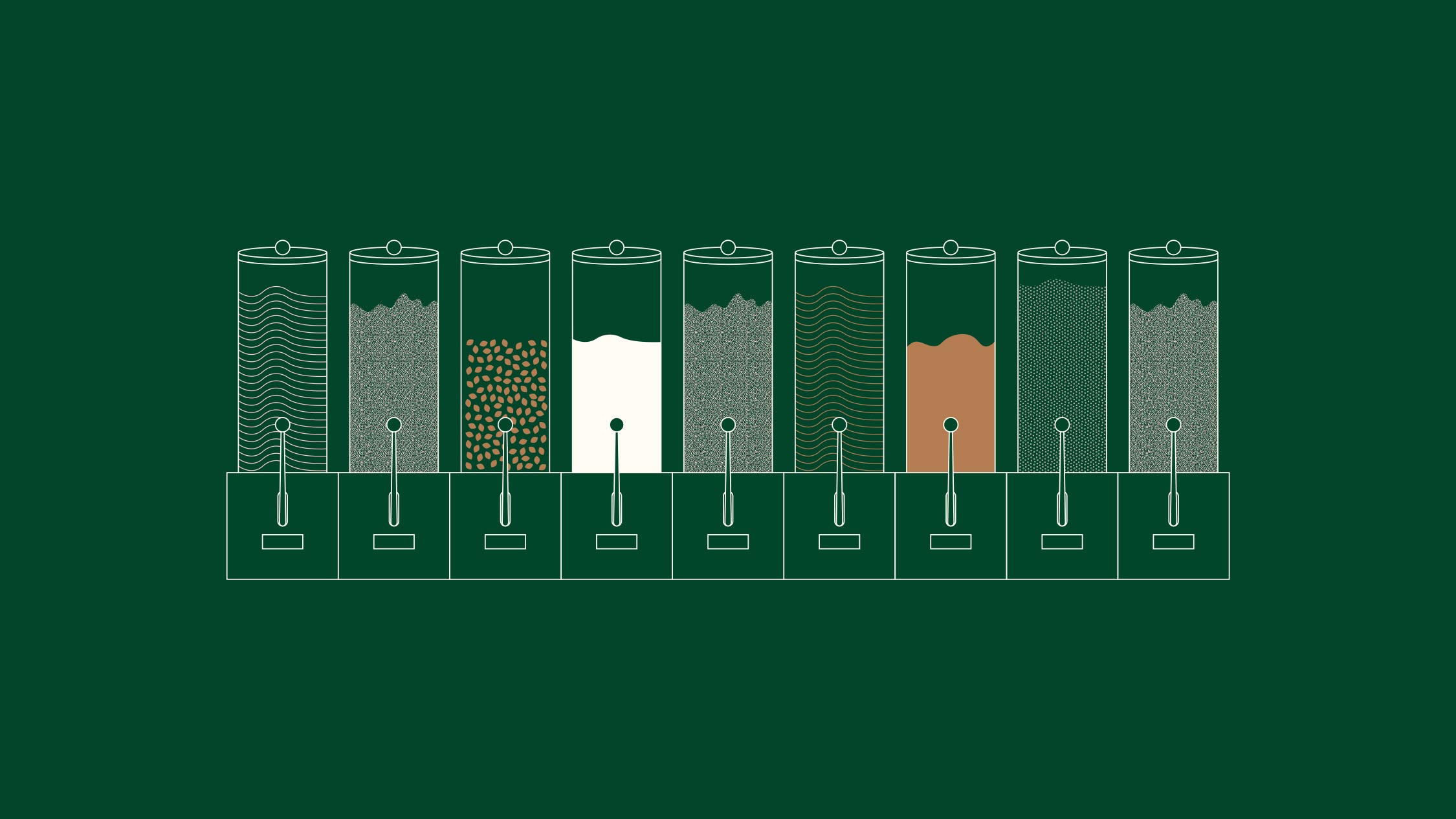
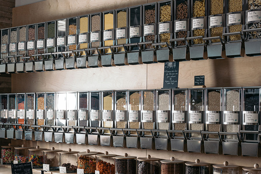
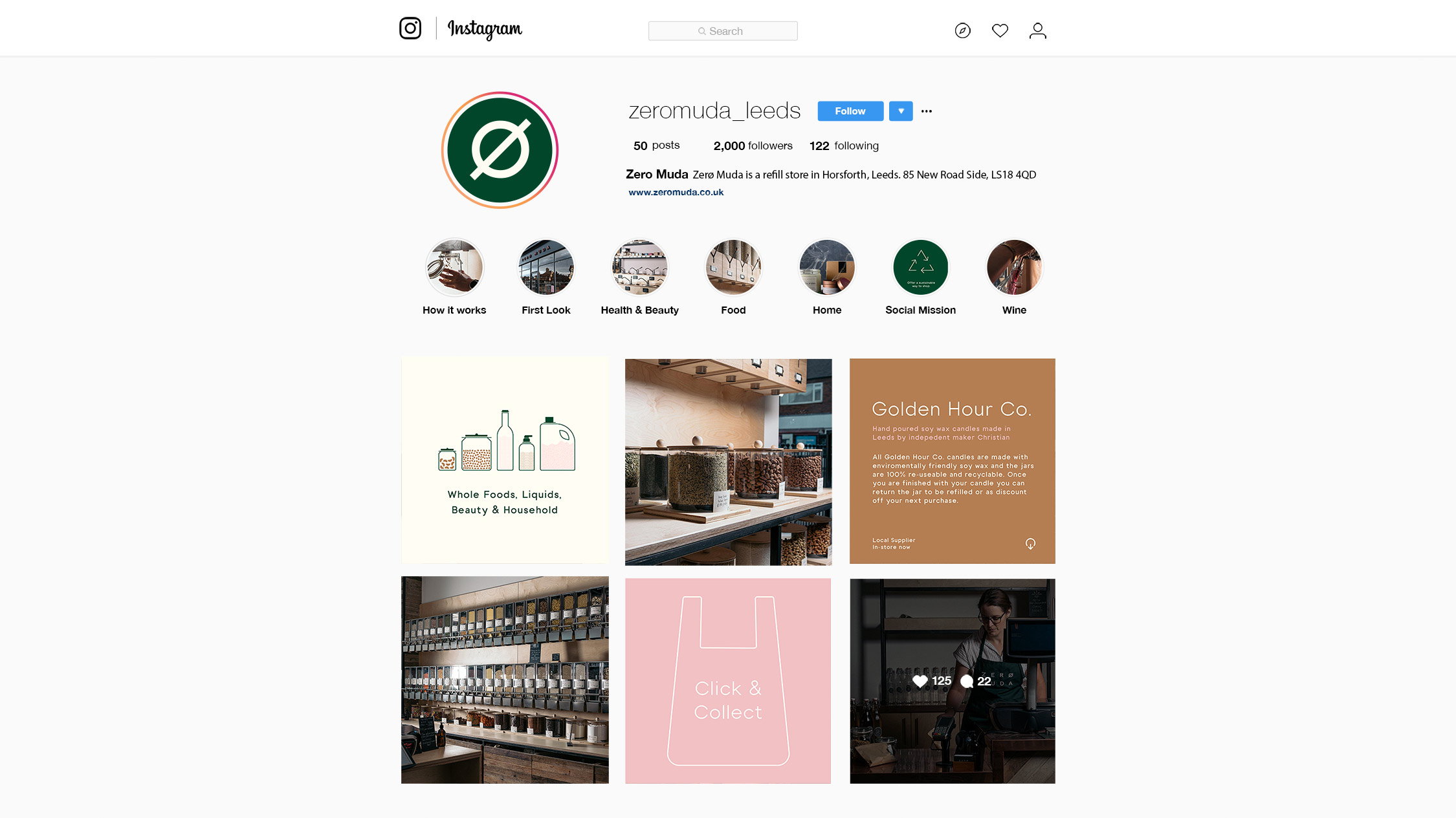
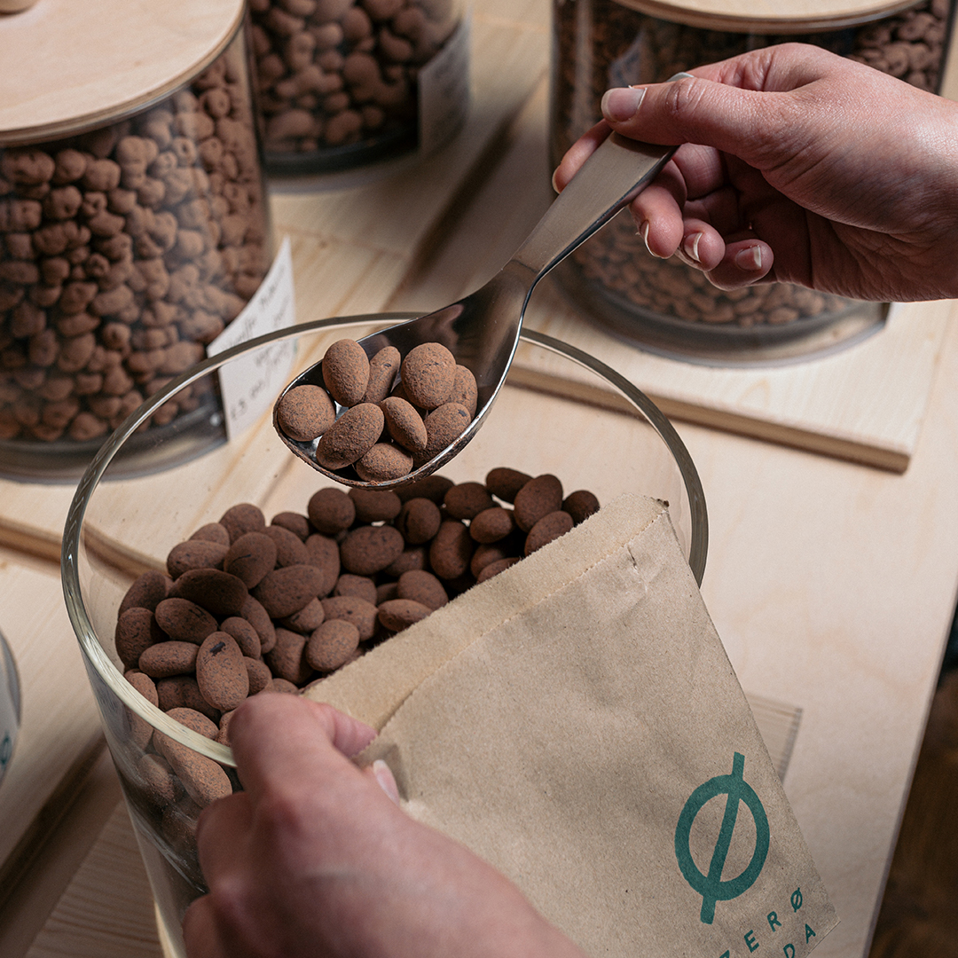
Once through the door, and in order for people to make the jump to re-fill shopping regularly, we had to make the process as breezy as possible. Instructional illustrations paired with interactive social media posts are informative and instructive.

Zerø Muda is on a social mission, and any profits made will be channelled back into local community projects. Using suppliers who are both local and circular in supply, means packaging goes back and is reused, friendships are forged and business grows.

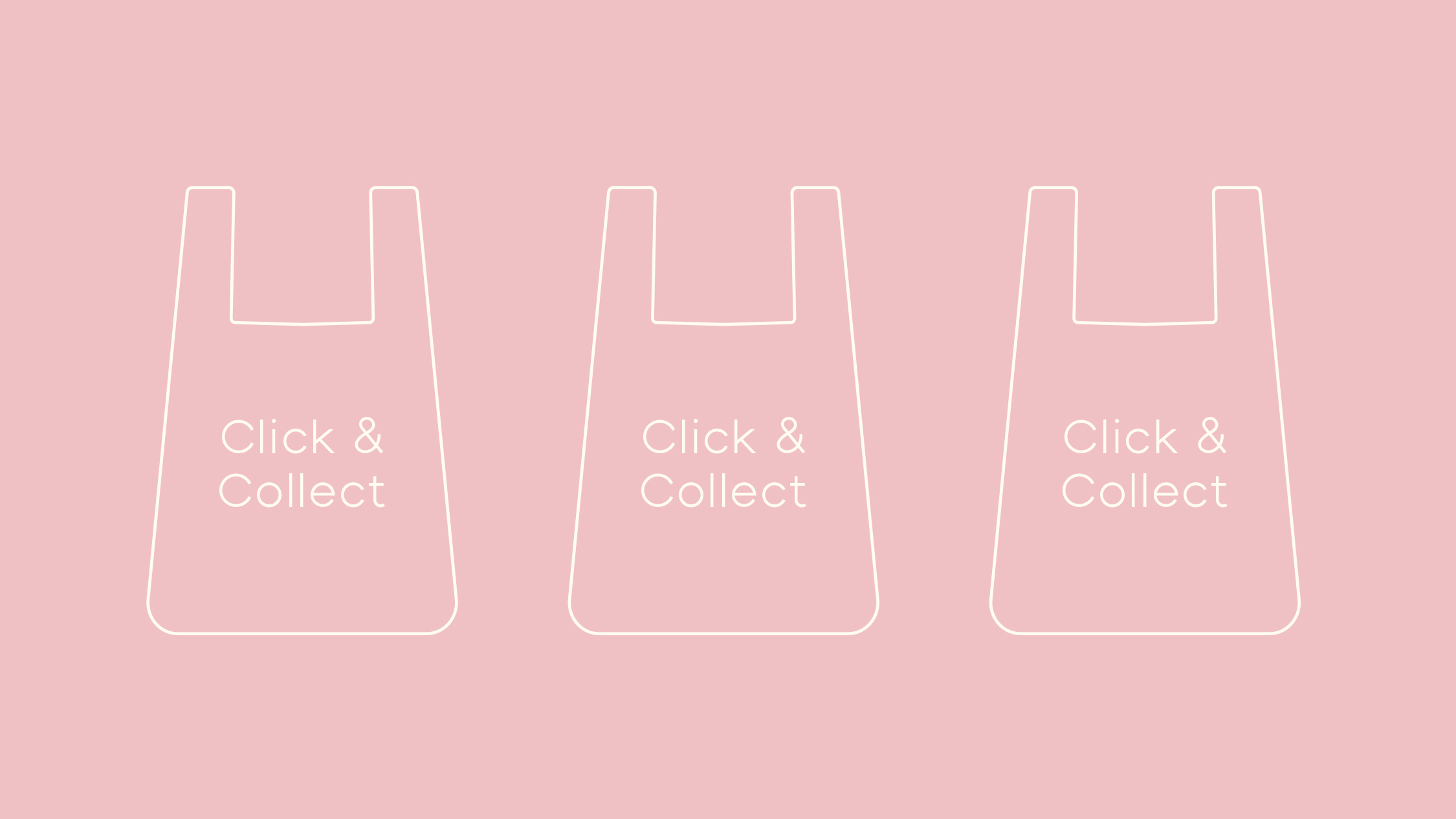
From the beginning a click and collect system was an important business asset. We designed a bespoke e-commece website which utilised three column scrolling store to allow the customer to browse and purchase with ease and accessibility.

It was a pleasure to work with Zero Muda on a store that wears its social conscience on its sleeve. As a business they consider all elements of running a sustainable shop, and their priority is supporting not only reducing waste, but improving the community at every step of the process.
“Turtle & Hare listened to what we wanted to achieve and worked with us to make it happen. From creating logos, building a website, designing social media pages and signage for the shop through to advertising, scheduling posts and doing promotional videos, Lucas and the team were professional, creative and pleasure to work with. Their knowledge of local services has been invaluable and I wouldn’t hesitate to recommend them.” – Zero Muda